Although Rubber Cheese has been established for 15 years, and we have an incredibly experienced team, we’re constantly learning and evolving our practices. Every day presents a new challenge and this was especially true when a client tasked us with designing and building a fully accessible website for children with autism.
Unfortunately, it’s all too easy to forget about inclusivity when it comes to design; maybe we’re pressed for time or the client hasn’t specifically asked for a disability-first approach, or perhaps we’re just unaware of the unique challenges some people face when online. Either way, thoughtless design can lead to a frustrating user-experience and a steep decline in conversion rates for businesses.
While working on this project, our design team delved deeper into the world of accessible design and put together a handy guide for digital designers. We believe:
“Apps and websites should be designed with everyone in mind; surfing the web is a universal pleasure. There are plenty of factors to consider – including colour, language and the amount of content displayed.
Taking an inclusive approach makes a website infinitely better for ALL users. Nobody can argue with clearer layouts, more concise copy (we all hate word-vomit) and clever use of visual descriptors such as icons and images.”
Designing for users with a visual impairment
Colour contrast
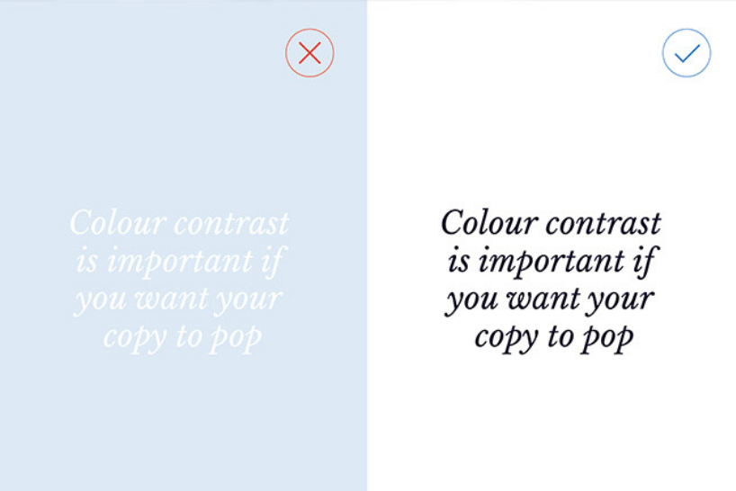
Colour contrast is important if you want your copy to pop. Needless to say, light text on light background is a big no-no and certain colour combinations are indecipherable for those who are colour blind. Red and green, green and blue, blue and purple and green and brown are particularly problematic pairings. If you visit colourblindawareness.org, you can see how difficult it is for people to tell them apart. Instead of just relying on colour to highlight important text, focus on weight and emphasis instead (bold, italics etc.).
Econsultancy highlights some fantastic tools for designers to use when assessing the visibility of their site, including contrast checkers and visual impairment simulators.
Icons
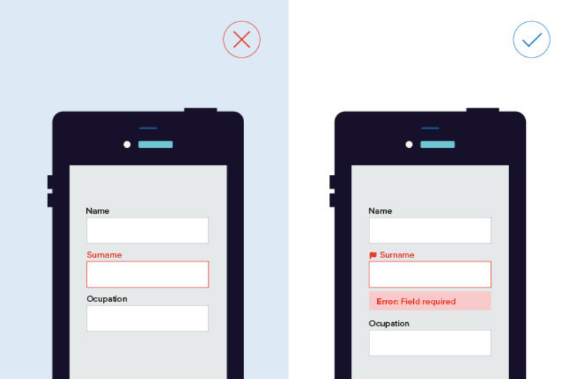
As mentioned above, colour alone isn’t enough to draw attention to copy – there must be additional signposts. For example, when creating error notifications on forms, don’t simply change the field stroke to red. Instead, add a warning message directly below the field and consider using an icon to highlight the area that needs attention.
Links and call to actions
Place buttons and links in areas you would expect to find them. This is good for usability in general because it stops people from having to trawl through unnecessary information. An intelligent layout makes the journey from A to B smoother.
Designing for deaf users and hard of hearing people
Supporting text for videos and images
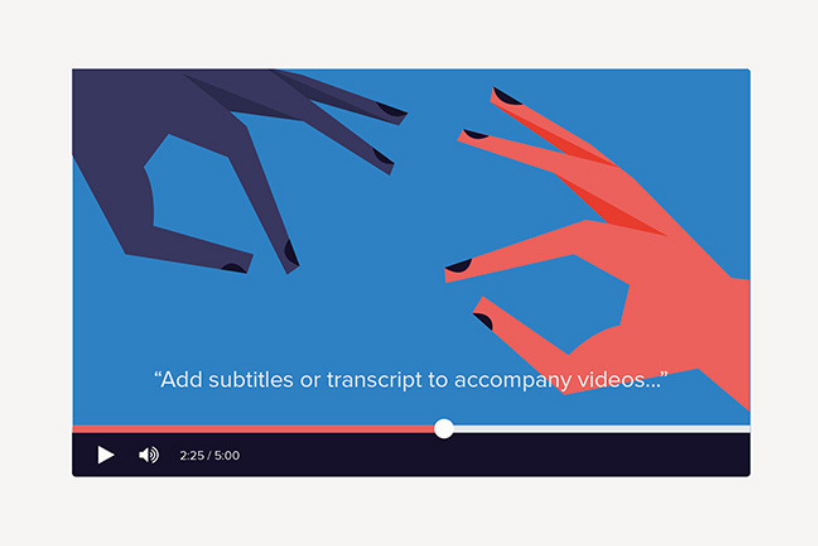
Add descriptive text to images and provide subtitles or transcripts for videos – this way, users aren’t reliant on audio to get their information. This is also beneficial to all users as well as being good for SEO.
Simplicity in language
Remember, for some deaf people, Sign Language might be their first language over English, so it’s integral to keep the copy as concise as possible. Flowery or long-winded sentences create a needless barrier between the user and the information they’re trying to access. The phrase “less is more” applies here.
Communication
Think about how your users prefer to communicate; in this instance, phone calls aren’t ideal. It’s important to feature alternatives such as an email address. SSE, an energy company, does this well. They provide visitors with several methods of communication, including SignVideo (where a BSL interpreter translates between the individual and customer service), web chat, online forms and an email address.
Designing for people with dyslexia
Typography
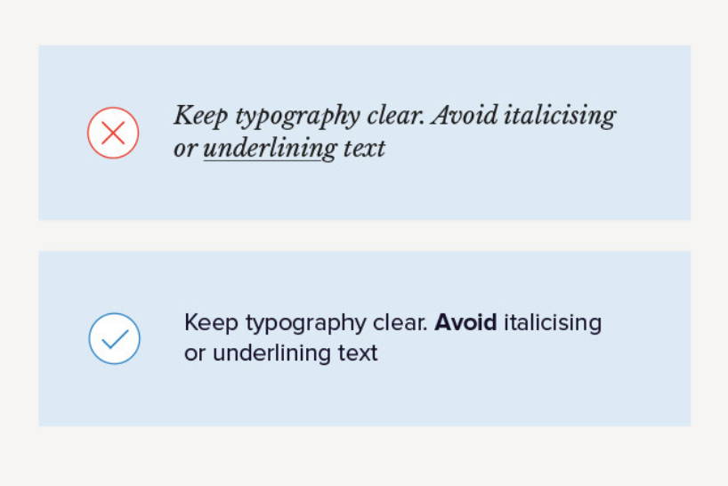
Use a sans-serif font, perfect for conveying simplicity and modernity. Alternatively, there are typefaces that have been developed especially for dyslexic users, such as OpenDyslexic and Dyslexie. Avoid italicising or underlining text because it can distort letters; if you need to highlight a word or section of copy, use bold text or icons instead. Readability tools are also helpful; they allow users to adjust font size, line height and mask certain areas of the screen to improve focus.
Simple and manageable content
Split text into easy-to-digest chunks and make sure the language is to the point; it’s easier for those with dyslexia to decipher shorter sentences and simpler words. Headers and bullet point lists are great ways to make copy more manageable. Narrower text columns are proven to be easier to read; a good rule of thumb is to use columns with no more than 80 characters per line.
Mixed media
Introduce videos, images and audio clips to your website to provide alternative ways for visitors to digest information. Infographics are also really useful tools because they summarise a copy’s key points.
Designing for people with autism
A clean and uncluttered design
Keep designs and layouts uncomplicated; if you cannot explain the reasoning behind a certain asset, then get rid of it. As much as patterns and textures on websites can bring them to life, they should be avoided when designing for people with autism; busy pages can be overwhelming and distract from the site’s main message. To ensure clarity is maintained, allow for a lot of space around text by using wide margins. It’s also important to avoid a crossover of information; to do this, make sure the content is displayed vertically instead of side-by-side. Separate pieces of information should be clearly defined using panels or headings.
Consistency
Consistency is very important in digital design but especially so for autistic users. For example, buttons should be placed in obvious areas as well as being consistent in their design. Colours, images and tone shouldn’t change page to page. You want your website to feel safe and reassuring with no unexpected surprises. It’s important to note that consistency includes keeping pages static – moving graphics and pop-up videos can cause confusion because people with autism often have heightened sensory awareness.
Colour
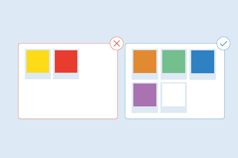
There are particular colours that are more sympathetic to those with autism. It’s acceptable to use bright colours but not florescent shades – these can be too intense. Light text on dark backgrounds can also be hard to see and read.
Recommended colours: Orange (energetic and warm), green (peaceful – avoid lime green as it’s too vibrant), blue (calm and increases trust and loyalty), purple (relaxing and encourages productivity) and white (refreshing and clean).
Colours to avoid: Yellow (causes eye strain and agitation) and red (increases heart rate and aggression).
Language
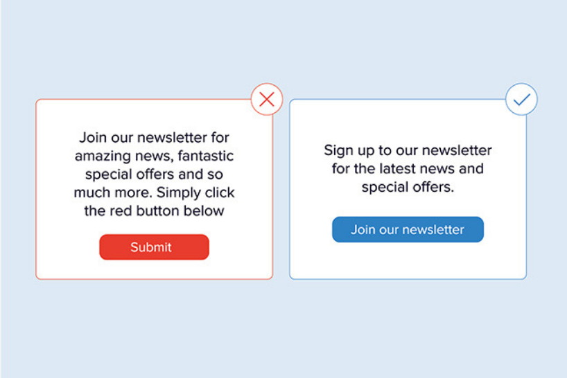
It’s important to be succinct in your language and as literal as possible. Avoid being over-emotive; metaphors, exaggeration or ambiguous language can be hard-to-follow. For clarity’s sake, give clear directions throughout the site – don’t assume the user will act a certain way. Label buttons clearly to explain where you will be directed to and provide navigation tips (click here, play this video etc.).
Designing for people with motor-skills disabilities
Speech recognition
Those with motor-related disabilities often need to rely on speaking commands when using digital media. By using software such as Dragon Naturally Speaking, the user can navigate through websites by using their voice as opposed to a mouse or touchpad.
Because of this, it’s important to keep all links and CTAs visible on the page. Don’t hide links and buttons in drop downs or sliding panels. Hiding links will prevent the software from accessing these areas, making the site unusable.
Precision
It’s important to be aware of the fact that, while some users may still be able to use the mouse or keyboard, it may be with reduced precision. Therefore, it’s a good idea to ensure that the forms on your website are tolerant of errors, such as submission errors or data entry errors.
For more information, visit W3C who have clear guidelines set out for accessible design.

Author:
Paul Wright Creative Director
Wag is the Co-Founder and Creative Director of Rubber Cheese. He has over 18 years of experience working in digital, and he merges his knowledge and hands-on approach to manage projects for global brands such as Pernod Ricard and Chivas Brothers.
He began his career as a brand and web designer, and his passion for all things design still thrives today. He describes himself as a champion of intuitive, user-friendly design, and his keen eye for detail is as strong as ever!
As a business owner and digital expert, he has a unique ability for finding and understanding the challenges that businesses face. He loves nothing more than using his creativity, knowledge and experience to develop BIG solutions.
Related articles
Digital
We developed a sensory guide for Eureka! The National Children's Museum
Visitor Attractions
Why your visitor attraction needs a digital annual pass system
Strategy
Receive a free personalised digital strategy guide to transform your customer’s online experience