Earth, the third planet from the sun, is the fifth largest planet in the solar system; only the gas titans Jupiter, Saturn, Uranus and Neptune surpass it. Around 71% of the planet’s surface is covered with water; however, despite rivers, lakes and oceans separating communities, cities and countries, we’re more connected than ever. It’s this ability to travel to far-flung locations, without leaving the comfort of our homes, that has given us new markets to explore.
For many, speaking to people from around the world has become the norm; whether it’s through gaming, social media or email, we’re bridging geographical divides and connecting with new cultures in a previously unimagined capacity.
The 2018 Global Digital reports from We Are Social and Hootsuite reveals there are now more than four billion people using the Internet, with China, India and America topping the leaderboard. Africa, the world’s second largest and most populous continent, has seen the fastest online growth.

Do your research
Success starts with a helluva lot of research; before perusing fancy translation plugins and redesigning your website, you must first gain a better understanding of the people in the areas you want to target. It’s this groundwork that will influence how you communicate verbally and visually moving forward.
The best way to learn about your audience is by immersing yourself in their culture. Don’t worry, you don’t have to relocate or spend years perfecting the language but you should spend plenty of time speaking with individuals who represent the community and visiting as many regions within that area as possible.
Much like in the UK, people’s online behaviours are affected by age, gender and location, so be sure to learn the views and preferences of as many demographics as possible.
With more people than ever connecting globally, it only makes sense for brands to do the same. Tapping into international markets provides fantastic opportunities for growth but effectively engaging with new audiences is a notoriously tricky task.
Success takes research and a reevaluation of your website’s design; being a helpful bunch, we’ve put together some tips to get you started!
Rethink your site’s design
While it’s important to verbally connect with your audience, it’s vital to think about how you do so visually as well. Translating your site doesn’t just mean changing the language. It involves reworking the entire design, from colour choice through to navigation.
Research design trends
Culture, history and politics heavily influence a country’s graphic design; therefore, what works well in the UK won’t necessarily resonate with a Spanish or Chinese audience.
Let’s take the French as an example. Known as pioneers in the fashion, art and luxury goods sectors, their visuals exude sophistication. What’s more, a general distrust of pushy advertising methods means designers and marketers must be more original and subtle when selling goods or services. Clichéd images and obvious copy is frowned upon in favour of innovative and cutting-edge concepts. Furthermore, distinguished design schools around France often require students to draw. As a result, exquisite illustration work is often woven throughout their website design.
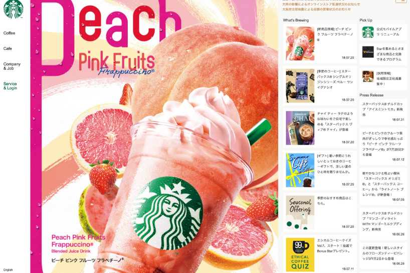
While finesse works for the French, this style would crash and burn in Japan. Here, rainbow colour palettes, flamboyant cartoon mascots and information dense websites reign supreme. These motifs are born from the country’s eclectic pop culture, which is saturated with anime, manga, comic books and cosplay.
Colours, images and symbols
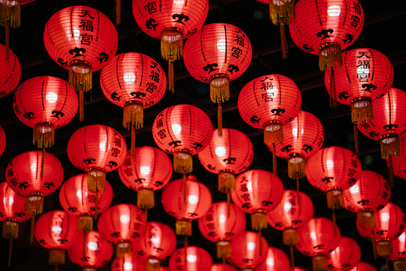
In Western countries, green means good and red signifies danger. However, in China, red represents happiness while green is unlucky (it’s associated with infidelity). Similarly, in the West, white conjures up images of matrimony, cleanliness and peace; yet, in China, Korea, and other Asian countries, white is the colour of mourning.
Scandinavian graphic design favours sky blues, earthy browns and glacial greys, all of which pay homage to the region’s abundance of natural beauty. Roughly 1,600 miles away, Spanish designers heat things up with flamenco dancer reds and ruby sangria hues.
Similar to colours, images and symbols must be vetted to guarantee they’re culturally sensitive. Do they represent many nationalities? Will they make sense to a wider audience? Do they contain elements which could be considered offensive to your target market?
Allow for currency conversion
If you’re building an e-commerce website for international audiences, you need to install a multi-currency converter. This will make it easier for users to shop and compare prices; ultimately, the less stressed the customer, the better the conversions.
If you make the shopping process painless, customers are more likely to choose you over the competition. Plus, taking the time to cater to your audience improves consumer trust, which is even more important when shopping abroad.
Make contact easy
Customers like to chat but it’s all too easy to get lost in translation. When building a contact page, it’s best to keep things as clear as possible.
List your phone number on the website in international dial code format to make it easy for customers to get in touch. As well as this, make contact forms easy-to-use. In the UK, we typically include fields for first and last names but this isn’t a universal practice – some countries group the two together.
It’s also important to consider seemingly small differences. For instance, some countries, including the majority of Asian countries, list the family name before the first name. Rejigging contact forms to cater to this will avoid unnecessary confusion.
Loading speed and device
While internet use is growing rapidly in regions such as Africa and South America, most people still have slow connections or limited access to the web. To help users, make your site’s load time as quick as possible.
Provide as much information as you can on the main screen, taking away the pain of endless scrolling, and think about the devices people are accessing your site from. Some phones may have bandwidth and performance limitations, so be wary of content that takes too much time to appear (large graphics, videos and animations). Plus, make sure to create plenty of downloadable content so offline users can still access information if their connection drops.

Break the language barrier
Dominating international markets means smashing down the language barrier. You have two options: The easy way or the hard way? Firstly, and arguably more difficult, is finding a fluent translator who can decipher your content. The second is to install a translation plugin.
Finding a good translator costs more time and money but your translations will be more accurate because a native speaker better understands colloquialisms and the intricacies of local dialect.
The next option is to install a translation plugin. This is less taxing but, like anything that sounds too good to be true, there’s a catch – these tools won’t translate your website perfectly. If you use this method, make your copy as simple as possible and carry out thorough research on the best programmes available before investing.
Remember, language affects a website’s layout. For example, German typically takes up to 30 per cent more space than English. On the flip side, many Asian languages require fewer words to say the same thing. These potential hurdles need to be taken into account at the design stage.
We hope this article has been helpful – if you like this, you might like our how-to guide on how to create accessible websites.
Image credits: Unsplash, Unsplash, and Pexels.

Author:
Paul Wright Creative Director
Wag is the Co-Founder and Creative Director of Rubber Cheese. He has over 18 years of experience working in digital, and he merges his knowledge and hands-on approach to manage projects for global brands such as Pernod Ricard and Chivas Brothers.
He began his career as a brand and web designer, and his passion for all things design still thrives today. He describes himself as a champion of intuitive, user-friendly design, and his keen eye for detail is as strong as ever!
As a business owner and digital expert, he has a unique ability for finding and understanding the challenges that businesses face. He loves nothing more than using his creativity, knowledge and experience to develop BIG solutions.
Related articles
Digital
Accessible design - creating websites for everyone
Digital
Why your business needs online customer reviews
Digital
Bespoke vs off-the-shelf: What’s best for your business?