There are nearly 14 million people with a disability in the UK – in this blog, we explain how to include them in your online experience through accessible design. We run through how to design for users with a visual impairment and users who are deaf or hard of hearing, plus we give best practices for designing for those with dyslexia, autism or motor-skills disabilities.
Why is accessible design so important?
Many people forget about accessibility when it comes to digital design.
Maybe they’re pressed for time, working with a tight budget or just unaware of the challenges people with disabilities face when navigating the web.
Whatever the reason, it’s not good enough – pushing accessibility to one side leads to a frustrating user-experience and a steep decline in conversion rates and visitor numbers.
Taking an inclusive approach to design makes a website infinitely better for all users – nobody can argue with logical layouts, concise copy and the clever use of visual descriptors.
Plus, there are nearly 14 million people with a disability in the UK and many of them would love to visit your attraction. Don’t shut them out! Make sure you’re clear about how you cater for people with disabilities – highlight key information, carer pricing and optimise the website for easy navigation.
Start by implementing the simple design changes listed below.
Designing for users with a visual impairment
Make your copy legible by adjusting the colour contrast
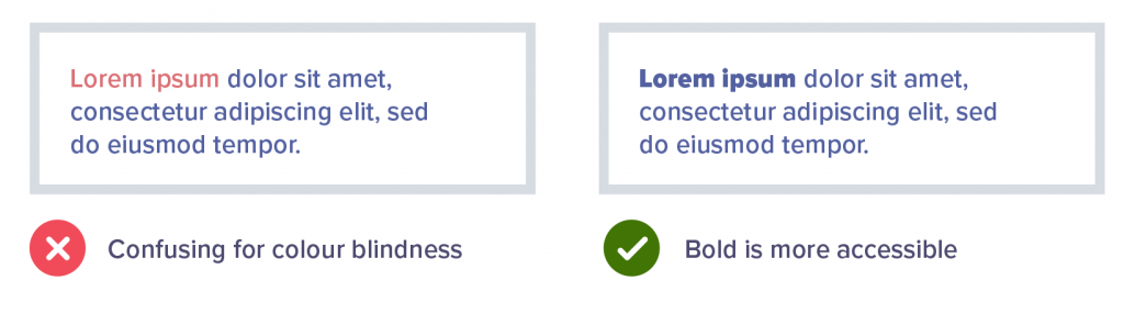
Avoid light text on a light background and remember certain colour combinations are indecipherable for those who are colour blind.
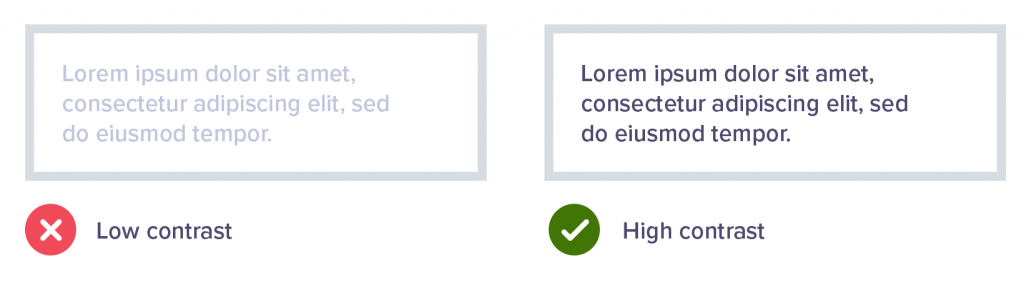
Red/green, green/blue, blue/purple and green/brown are particularly problematic. If you visit Colour Blind Awareness, you can see how difficult it is for people to tell them apart.
Instead of relying on colour to highlight key text, you could make it bold, italic or change the font.
Below are some fantastic tools for designers to use when assessing visibility, including contrast checkers and visual impairment simulators.
Tells you if your background and text colours pass AA & AAA colour contrast requirements.
Is a colour blindness simulator for Windows, Mac and Linux. It takes the guesswork out of designing for colour blindness by showing you what people with common colour vision impairments see.
Is a Chrome and Firefox add-on which can simulate many forms of visual impairment including colour-blindness.
Use icons as additional signposts
You can also use icons to draw attention to key information. For example, when creating error notifications on forms, don’t just change the field stroke to red. Instead, add a warning message directly below the field and use an icon to highlight the area that needs attention.
![]()
Include clear links and call to actions
Place buttons and links in logical places – don’t hide them in the middle of large chunks of copy. This helps users move more intuitively through the website.
Designing for users who are deaf or hard of hearing
Add supporting text to videos and images
Descriptive text, subtitles and transcripts remove barriers to information for deaf and hard of hearing people. Plus, it’s pretty handy for search engine optimisation (SEO). We love Rev and Scribie – they’re affordable, fast and reliable transcription tools.
Keep language simple
For some people, Sign Language might be their first language.
This means colloquialisms* and complicated English sentences could get lost in translation. It’s better to keep copy concise and to the point – nobody likes waffle.
*A word or phrase that is not formal or literary and is used in ordinary or familiar conversation.
Provide different methods of communication
How do your users prefer to communicate? If they’re deaf or hard of hearing, they might prefer to use email instead of talking on the phone.
Have a look at what SSE does, one of the UK’s largest and fastest growing energy companies and a FTSE 100 company. They provide visitors with several methods of communication, including SignVideo which allows a BSL interpreter to translate between an individual and customer service.
Designing for people with dyslexia
Select appropriate typography
Use a sans-serif font, or choose a typeface that has been developed specifically for dyslexic users, such as OpenDyslexic or Dyslexie.
Avoid italicising or underlining text because it can distort letters – if you need to highlight a word or section of copy, use bold text or icons.
Readability tools are helpful because they allow users to adjust the font size, line height and mask certain areas of the screen to improve focus.
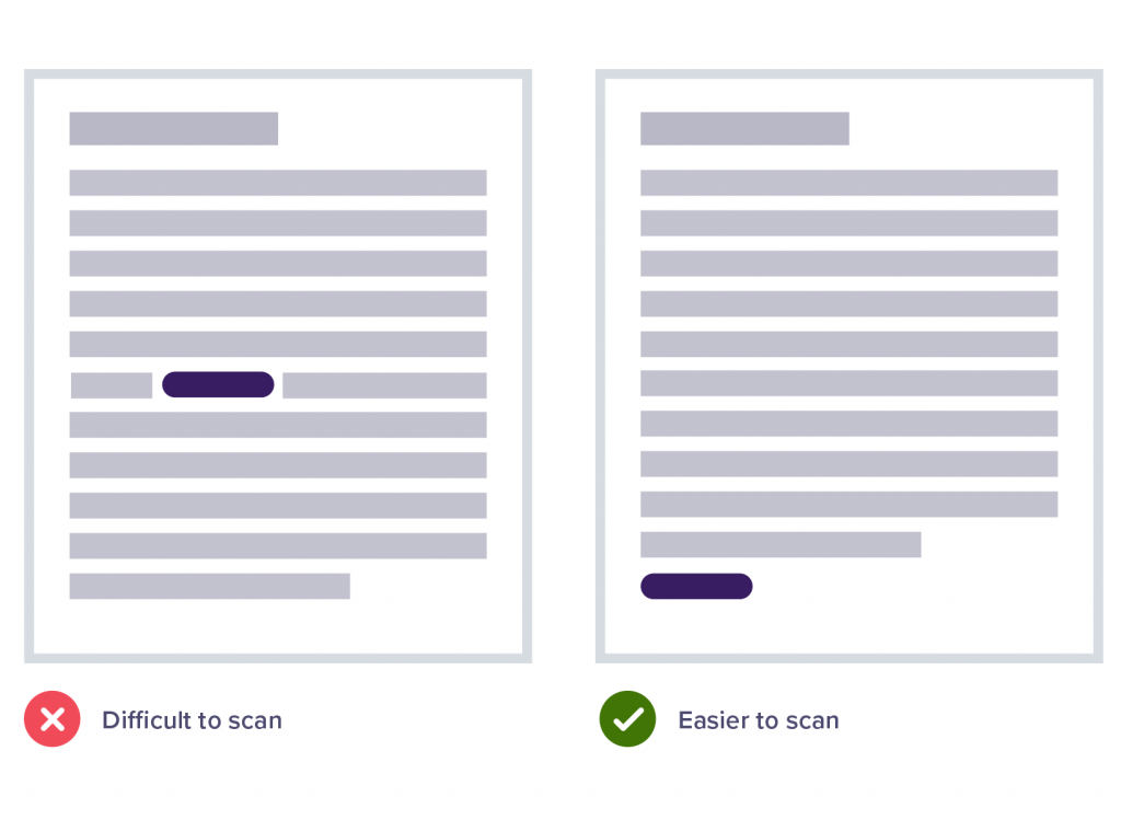
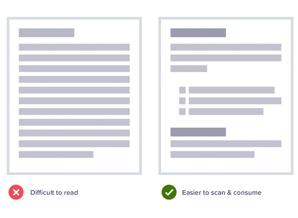
Split content into easy-to-digest chunks
Headers and bullet point lists are great ways to make copy more manageable, and narrow text columns are easier to read – a good rule of thumb is to use columns with no more than 80 characters per line.
Designing for people with motor-skills disabilities
Speech recognition
Those with motor-related disabilities often rely on speaking commands. By using software such as Dragon Naturally Speaking, the user can navigate websites with their voice as opposed to a mouse or touchpad.
Don’t hide links and buttons in drop downs or sliding panels. Hiding links will prevent the software from accessing these areas, making the site unusable.
Precision
Remember, while some users may still be able to use a mouse or keyboard, it may be with reduced precision. Therefore, it’s a good idea to ensure that the forms on your website are tolerant of errors, such as submission errors or data entry errors.
Designing for people with autism
Make your design clean and uncluttered
To avoid overwhelming users, make your layout and site design clean and simple.
Allow for plenty of space around text by using wide margins and avoid a crossover of information – to do this, make sure the content is displayed vertically instead of side-by-side.
Separate pieces of information should be clearly defined using panels or headings.
If you need some inspiration, take a look at the sensory guide we produced for Eureka! The National Children’s museum.
Keep things consistent
Consistency is essential for users with autism because it makes their online experience feel safe and reassuring.
For example, buttons should be placed in logical places. Colours, images and tone shouldn’t change from page to page.
Keep pages static – moving graphics and pop-up videos can cause confusion because people with autism often have heightened sensory awareness.
Choose colours carefully
Particular colours are more sympathetic to those with autism.
It’s acceptable to use bright colours but not fluorescent shades – these can be too intense. Light text on dark backgrounds can also be hard to see and read.
Recommended colours: Orange (energetic and warm), green (peaceful – avoid lime green as it’s too vibrant), blue (calm and increases trust and loyalty), purple (relaxing and encourages productivity) and white (refreshing and clean).
Colours to avoid: Yellow (causes eye strain and agitation) and red (increases heart rate and aggression).
Conclusion
As you can see, taking an accessible approach to design makes a website infinitely better for all users, and there is no excuse not to implement the advice given in this guide (we don’t mean to sound harsh, but it’s true).
Accessible design ensures legibility and ease-of-use – adjusting the colour contrast makes copy easier-to-read, signposts point to crucial information and clear call to actions equates to more ticket sales.
As well as this, adding supporting text to videos and images not only means users who are deaf and hard of hearing can engage with the media, but it also means people are more likely to interact on social media.
And how could anyone argue with autism-friendly design, which encourages simple branding, logical layouts and digestible chunks of content?
The advice given in this guide is a starting point. If you’d like to explore accessible design further (and we highly recommend you do), visit the W3C who have clear guidelines and more advice.
Alternatively, get in touch today to see how we can help.
This article was taken from our free ebook – The Ultimate Guide to Doubling Your Visitor Numbers Download your copy today for 100’s of digital strategies to get more guests through your door.

Author:
Kelly Molson Managing Director
Host of the popular Skip the Queue Podcast, for people working in or working with visitor attractions, she regularly delivers workshops and presentations on the sector at various national conferences and universities including The Visitor Attractions Conference, ASVA and Anglia Ruskin University.
Related articles
Digital
4 simple UX strategies for a better online user journey
Podcast
50,000 visitors within three months of opening? No problem for William’s Den owners, Tor and Christian Carver
Visitor Attractions
3 things visitor attractions should focus on during the Covid-19 pandemic