Learn how to make your website faster and more user-friendly, and why these factors are so important in stopping visitors from leaving your website.
What is UX?
If you work in digital, you’ll know all about UX. If not, don’t fret – let’s take a look at how our trusty friends at Wikipedia describe it…
“User experience (UX) refers to a person’s emotions and attitudes about using a particular product, system or service. Additionally, it includes a person’s perceptions of system aspects such as utility, ease of use and efficiency.”
Still confused? This might help – if we were assessing the UX for your website, we would ask questions like:
Can users do what they need to do easily? A good way of judging this is by the 3-click rule – the theory that users will abandon a website if they’re unable to complete their task within 3 mouse clicks.
Can users complete tasks quickly? 55% of visitors spend less than 15 seconds on your website*, so every second counts when it comes to conversions.
And, most importantly, UX encourages you to think about how a guest feels while browsing your website and after they’ve left.
By adopting the following methods, you’re sure to improve the experience guests have on your website.
We’re giving this advice on the assumption that you already have an online booking system and a website that’s usable on all devices. If you don’t, get in touch today to see how we can help.
1 – Streamline the booking journey so users don’t click off before they’ve made a purchase
Imagine this…
You’ve made your mind up to visit an attraction – the place looks fantastic! You’ve browsed their social media photos and read positive online reviews. The VIP experiences are particularly tempting.
Full of enthusiasm, you visit the website to buy tickets, but you can’t.
Well, maybe you can. You’re not really sure because the process is so confusing. After 5 minutes of pointless clicking, you’re annoyed. A few minutes later, the excitement has vanished entirely, and you leave the website. The tickets remain unpurchased.
To avoid this, you must streamline the booking journey by implementing the below methods.
Remove distractions
Once a user is past the basket page, they’re ready to purchase – remove any items that distract them from making the payment. This means streamlining the main navigation by removing any navigational links.
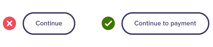
Label buttons clearly
This ensures users know what to expect when they click. For example, instead of saying “continue”, say “continue to payment”. This gives people more confidence during the journey.
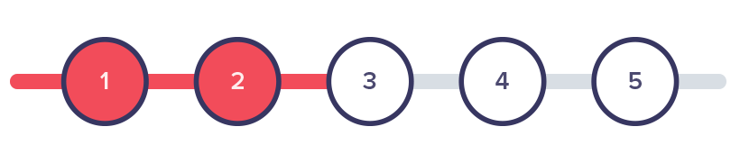
Include a progress bar
Let users know exactly how many steps they need to take to purchase their tickets and what stage they’re currently at.
Include a basket overview
Make sure there’s either a review order page or a basket overview on each page of checkout. Users need to feel confident they’ve made the correct selection before they proceed with their payment.
Need help?
Add a “need help?” area on each page of the checkout with a phone number. If someone experiences problems, they can easily call you to book or ask questions.
Clear next steps
Once the payment is confirmed, be really clear about what the guest needs to do next.
Allow them to download their tickets immediately in PDF format and send an email with the same downloads. If a user has bought their tickets on mobile, it might be hard for them to print, so give them the option to save their tickets to Apple Wallet or Google Pay. Additionally, let them save the date of arrival to their calendar as a reminder.
2 – Improve your website’s speed
Here’s some scary statistics – according to sources, a 1 second delay in a page’s load time results in:
- 11% fewer page views
- 16% decline in customer satisfaction
- 7% decrease in conversions
Your website’s speed matters – and it matters to your users. If they can’t locate information or book tickets quickly, they’ll look elsewhere for their magical day out.
How can you make your website faster?
Optimise images
Large and unnecessary images have a considerable part to play in slowing down your website, so make sure every photo serves a purpose and is optimised for the web.
To do this, use Kraken Image Optimizer, TinyPNG and JPEG Optimizer.
Be mindful of what format your images are uploaded in.
- PNG files are larger and retain the quality of complex images – they’re ideal for logos as they support transparent backgrounds.
- SVGs are ideal for logos and icons, they’re tiny in size and vectors, which means they’re infinitely scalable and won’t lose quality.
- GIFs are ideal for flat graphics that don’t have many colours, they support transparent backgrounds and can be animated.
- JPEG (JPG) files are best for photographs or images with gradients. They can be optimised to reduce the file size and are typically smaller than a PNG of the same photograph.
Use a CDN (Content Delivery Network)
One of the best ways to improve your website’s speed is to use a CDN (content delivery network).
A CDN is a global network of servers that duplicates and stores your website content – it then delivers this content to users from the servers closest to their physical location.
For example, if your website is hosted on a UK server, visitors from Australia would have to wait a frustratingly long time for your website content to download. But with a CDN, they receive information much faster because it’s sent from a local server.
CDNs store:
- Javascript
- CSS
- Images
- PDF files
- Videos
Try one of these popular CDNs:
- MaxCDN (the best WordPress CDN in the market)
- CloudFlare
- Amazon CloudFront
- Sucuri (a popular website security company)
Enable Caching
Caching is the industry term for storing files (such as HTML documents or images) in a temporary storage area. It makes websites faster because it means a page’s content is readily available and doesn’t have to be retrieved from its source each time someone visits.
There are plenty of caching plugins available on WordPress – the most popular being W3 Total Cache and WP Super Cache.
If your website isn’t on WordPress, caching gets trickier – the best course of action is to discuss alternatives with your hosting provider.
3 – Use chatbots for effortless communication
Chatbots are revolutionising the online customer service and sales experience.
According to studies, 63% of people would consider messaging an online chatbot to obtain “quick emergency answers”, and an incredible 37% of people said they would make a purchase through a chatbot.*
If done well, this speedy way of communicating with your guests improves consumer trust and brand loyalty.
There are tons of off-the-shelf chatbots available, including ChatBot, a platform that doesn’t require coding experience. It lets you create a variety of bots that can answer customer questions, gather feedback or streamline the buying process.
*Ref: Humanity in the Machine
4 – Make the buy button easy to find
The purpose of your website is to get people to book their visits online.
To achieve this, make the process as easy as possible and have a distinct booking button.
Highlight the button in a colour that’s complementary to your brand but stands out from the rest of the navigational buttons, use a clearly defined contrast and add a labelled icon next to the button which screams BUY TICKETS.
The best place to add this button is in the top right of the page – this is where users expect it to be.
Most importantly, don’t forget the mobile experience! Instead of hiding the button within the burger menu, give it a standalone icon (have a look at Eureka! for how we did this).
![]()
Conclusion
If you arm yourself with these UX tools and centre your guests in your website design and development, you’ll be amazed at how quickly visitors start coming.
These, sometimes tiny tweaks, have an incredible impact on your attraction’s success.
You’re increasing the probability of users completing desired tasks such as purchasing tickets online, signing up for your newsletter and reading your latest news.
Plus, by solving your guests’ problems quickly, you’re also cementing your reputation as a brilliant place to visit, both physically and online. And you know what that means – more word of mouth referrals and stellar online reviews.
We’ve given you the fundamentals – now it’s your turn to implement them. But if you need a helping hand (and who doesn’t from time to time?) get in touch with us today to see how we can be of service.
Photo by Caleb Jones on Unsplash
This article was taken from our free ebook – The Ultimate Guide to Doubling Your Visitor Numbers Download your copy today for 100’s of digital strategies to get more guests through your door.

Author:
Kelly Molson Managing Director
Host of the popular Skip the Queue Podcast, for people working in or working with visitor attractions, she regularly delivers workshops and presentations on the sector at various national conferences and universities including The Visitor Attractions Conference, ASVA and Anglia Ruskin University.
Related articles
Digital
9 tips for creating a powerful FAQ page for your website
Digital
Bespoke vs off-the-shelf: What’s best for your business?
Digital
4 simple UX strategies for a better online user journey