We recently worked with Eureka! The National Children’s Museum to develop a comprehensive education microsite – keep reading to find out how we did it.
The client
Our lovely client Eureka! isn’t like other museums – they’re the only fully interactive educational museum totally dedicated to children aged 0-11 anywhere in the UK.
Their mission is to engage children, from all backgrounds, in a range of play-based learning experiences which facilitate their emotional, intellectual, physical, social and creative development.
Eureka! is an educational charity and not-for-profit organisation – as such, they depend on the support of funders and charitable activities, such as outreach educational activities, to undertake new gallery developments and bring playful learning to children who may not get to experience it otherwise.
The challenge
Eureka! is renowned for providing a fun-packed experience for the whole family – however, they realised they could do more to strengthen their relationship with schools and reinforce their reputation as an educational venue first and foremost.
To do this, they had to overcome two central challenges:
- Schools are going on fewer trips in general. This is a result of several factors including tight budgets, safety concerns and a saturated market.
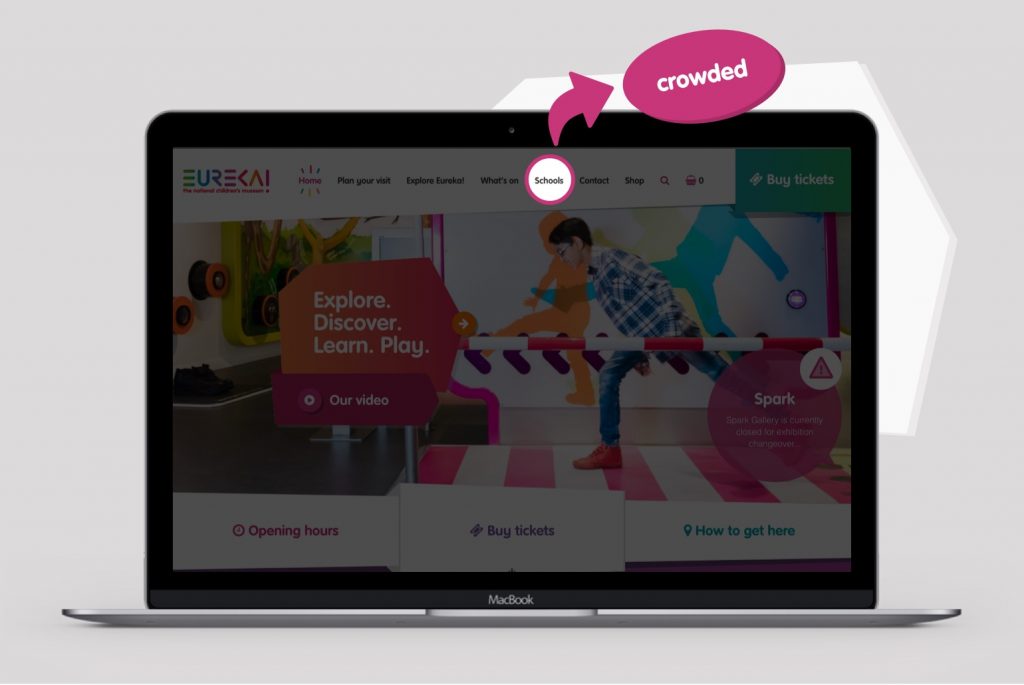
- Their main website worked wonderfully for general visitors but didn’t address teachers’ concerns and questions specifically. This is despite schools being a key focus of the museum’s activities.
Our goal
Eureka! carried out extensive user research, which allowed us to suggest creating an educational website. We decided to create a site explicitly geared towards a school audience as opposed to shoehorning this information into the main website. We wanted to give teachers and educators everything they needed in an intelligent and compelling format while reassuring them of Eureka’s incredible reputation for being a safe and professional learning environment.
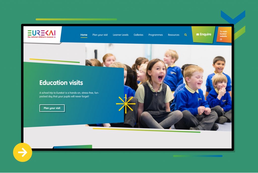
So, how do you design an education website for teachers?
Organised content specifically for schools
Teachers are extremely busy and they don’t have time to trawl through bucket loads of copy. Plus, they’re often looking for precise information and resources that aren’t of interest to the general public.
The only way to appeal to both a general and education audience was by separating the content and giving each group a tailored online experience.
We designed Eureka’s new microsite with teachers in mind and collated all the details needed to plan a school trip – ultimately, we wanted to make the process as straightforward as possible.
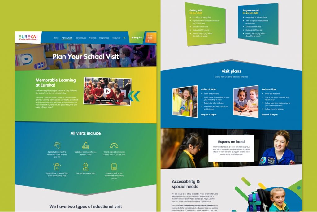
Let’s take the “Plan your visit” page as an example. It’s packed full of useful advice for teachers, covering:
- What the trip includes (e.g. dedicated lunch area for pupils)
- Types of educational visits available
- Visit plans (arrival times and itineraries)
- Team information
- Accessibility information
- Address details
- FAQs
- How to book
It would have been impossible to include this much detail on the main website without it getting lost.
We also made it simple for people to switch between the main site and microsite by including clear navigational links.
Logical structure and filtering options
It was important to structure content intelligently and create filtering options that worked in a school context.
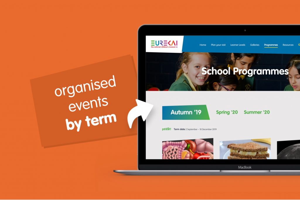
For example, we divided events by learner levels (Early Years Foundation Stage (EYFS), and Key Stages 1 and 2) and gave teachers the ability to search events by term instead of by month.
Compelling galleries
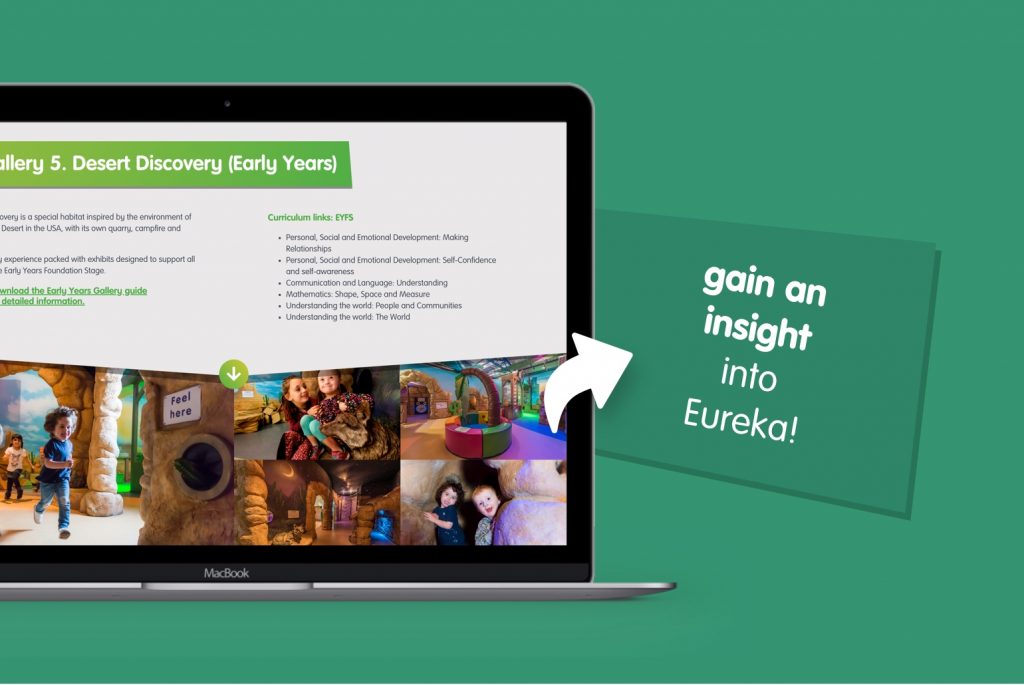
We created a section on the microsite which includes a treasure chest of compelling information about the museum’s galleries.
By using engaging photographs and videos, teachers gain an authentic insight into the Eureka! experience. Plus, each gallery section has direct curriculum links which explain how that particular exhibition supports the learning requirements.
If more information is needed, there’s even an option to download colourful PDFs which have more detail.
In-depth resource page
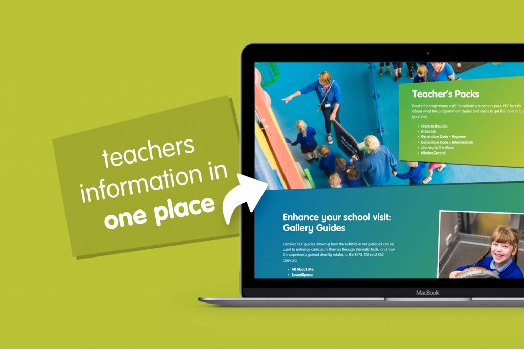
To help teachers prepare for the visit, we built a “Resources” page to store vital information in one place. It includes risk assessments, teacher’s packs, gallery guides and gift shop order forms.
Booking function
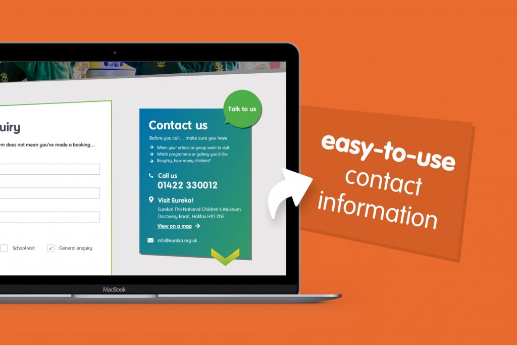
As all school bookings for Eureka! are taken over the phone, the contact number had to stand out. However, to minimise the number of unnecessary calls and save time for the Eureka! team, we included a “Before you call, it’s really helpful if you can have this info handy” section on the enquiry page.
We also included an e-contact form which allows teachers to submit queries outside of telephone-manned hours. The form is for initial enquiries only so, to avoid confusion, we incorporated a prominent message that made this clear.
New but distinct design
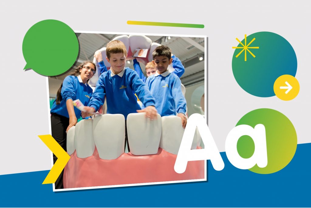
The microsite needed a separate identity to reflect the different experience it offered. So, we gave it a brand-new design, with different colours, shapes and icons.
Despite the differences, it’s still clearly connected to Eureka’s main brand and uses many of the same design techniques such as gradient effects. As well as this, the design had to accommodate a larger than normal amount of copy, without looking crowded or overwhelming.
Some parting words…
It was a privilege to work with Eureka! on improving their school offering.
In the words of our Designer, Ryan French:
“Overall this was a great project to work on. By making it a microsite we had a lot more flexibility on the project. We were not tied down to constraints from the current site. We had a lovely brand to work with and photography which always makes a project like this more enjoyable to work on. It’s a fun yet informal website which will help teachers find the right information more quickly.”
Let us know what you think of Eureka’s education microsite. If you’re looking to develop an educational website or resource centre for your attraction, get in touch today.
